Four persuasive design techniques charities can use to encourage donation
The amount of cash and coins that we carry is declining. Alternative payment methods are growing in popularity. As we move towards a more cashless society, online giving becomes an important form of income for charities.
The forecast is positive, total giving is predicted to rise 4.3% in 2017. It is well known that making the decision to give is more emotional than rational, so how can charities use psychology and persuasion techniques to maximise the donations they receive?
What is persuasive design?
There are many different psychological theories and principles we can apply in our designs to shape user behaviour. Persuasive design applies psychological principles to nudge users towards desirable actions. In this article, I am going to explain and illustrate some of these techniques.
Trust and credibility
Being credible and building trust with your users is crucial when you ask them to part with their money. Public trust in charities has been on the decline, so your users need to be certain that their money is going to a good cause. Use facts and provide evidence of any claims to build this credibility and trust. A professional, clear design also positions you as a genuine charity that deserves their donation
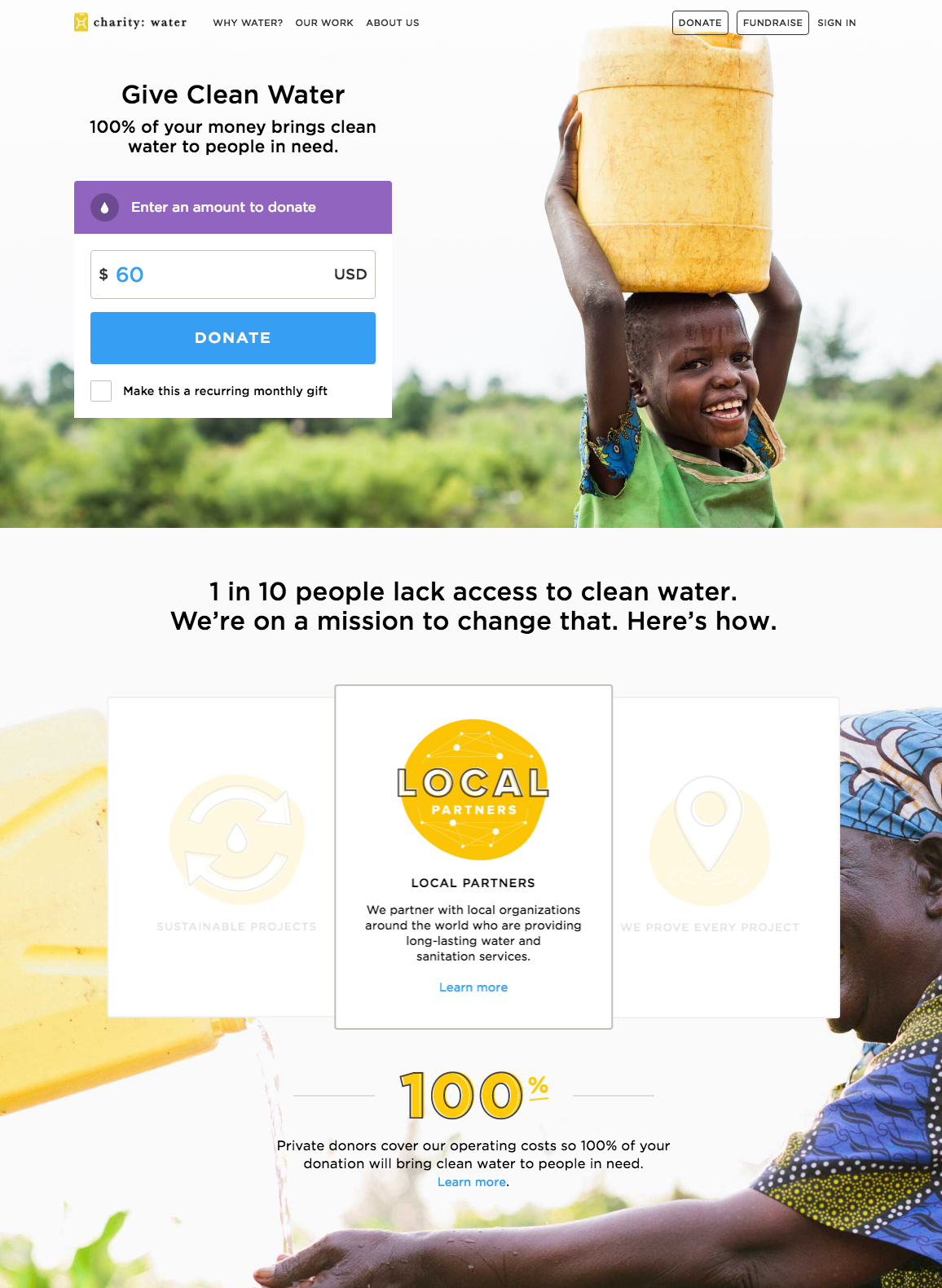
charity:water do a great job of building trust and credibility on their donations page.
- Three words into the page they state how your donation is used: ‘100% of your money brings clean water to people in need’.
- They state their mission clearly and provide three clear strategies for achieving it. This builds credibility that your donation can make a difference.
- They reiterate that 100% of your money goes towards the cause. This is evidenced with an explanation: ‘Private donors cover our operating costs’.
- The professional, clean and clear design builds trust in the brand.
(Note: the easy, simple donation process on charity:water is also worth checking out.)
Emotional triggers
Of all the persuasive techniques, tugging on heart strings is perhaps the most potent. After all, your ‘users’ are real people with real emotions. Once you have positioned your organisation as credible and trustworthy, emotional design can be the trigger that encourages donation. There are many ways of triggering emotional reactions; both imagery and copy can be used to great effect.
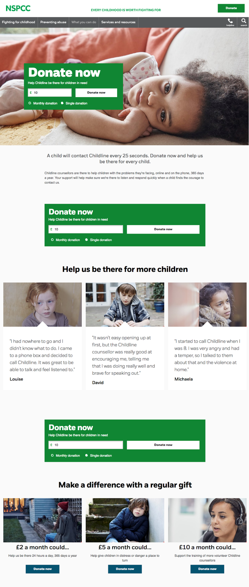
The NSPCC use a combination of human imagery and individual storytelling to trigger emotional reactions. We get drawn in when we see images of people and identify with them. The imagery triggers feelings of guilt and compassion. Supported by the personal stories of three children, this is powerful design.
It’s important to get the balance right when employing this tactic. The NSPCC do a good job of providing enough to trigger emotional reaction, without pushing too much and turning users away. With persuasive design techniques, it’s often about subtlety.
Contrast and reciprocity
Perceptual contrast and reciprocity are two theories that combine to create the ‘rejection then retreat’ technique. First ask someone to do something demanding (donate £50). If they do, fantastic. If they reject your initial request, then retreat and make a smaller request (donate £20).
This technique is extremely effective. By rejecting your first request, the user will feel indebted to you (reciprocity). In comparison to £50, £20 seems small (contrast). The power of these two persuasion techniques together is hard to overcome.
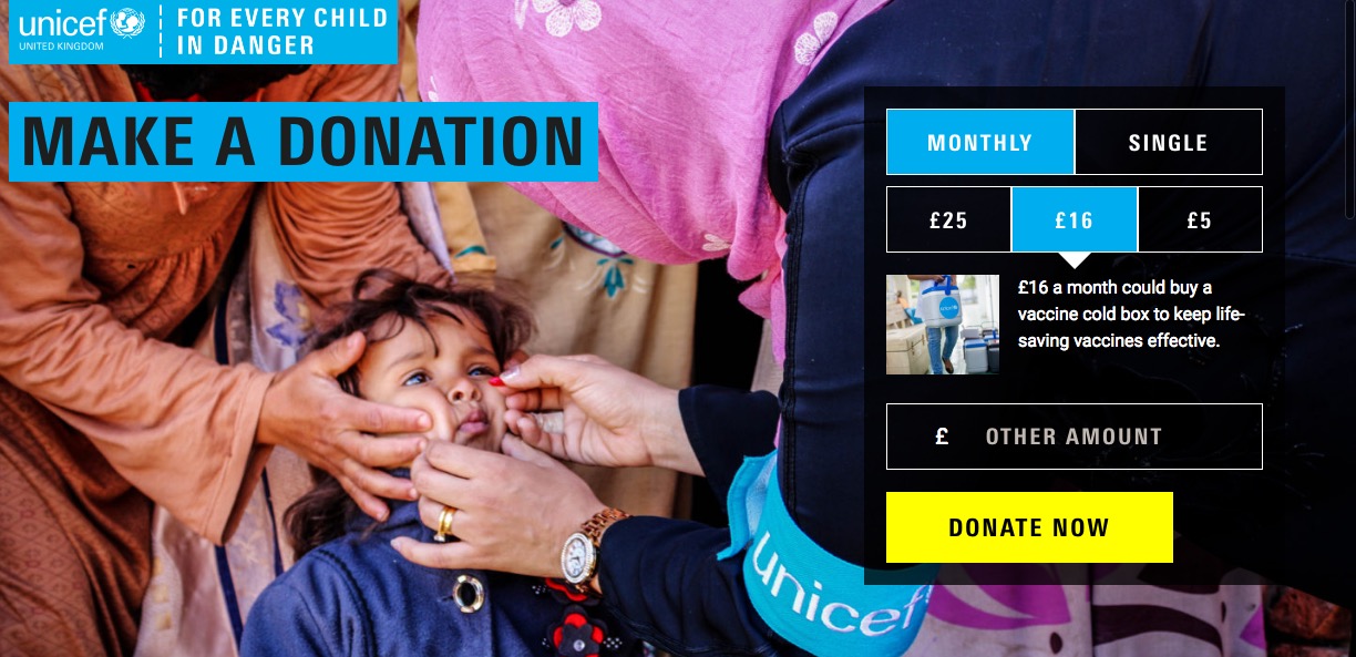
In this example from UNICEF you’ll notice there are pre-selections for both ‘Monthly’ and ‘£16’. The user may choose to reject both of these. Based on what social psychology tells us, if they do then they are more likely to move to ‘Single’ and ‘£5’ than to cancel their donation altogether.
There is an additional piece of consumer psychology used in this example, the ‘centre stage effect’. Given three options, users are most likely to pick the middle one unless there is significant value difference in the upper or lower options.
Commitment
This plays on the principle that once we feel an an obligation that we can successfully fulfil, we are more likely to follow through. We feel good when we fulfill our commitments. Through smart design and copywriting, we can build the feeling of commitment in users who are considering a donation.
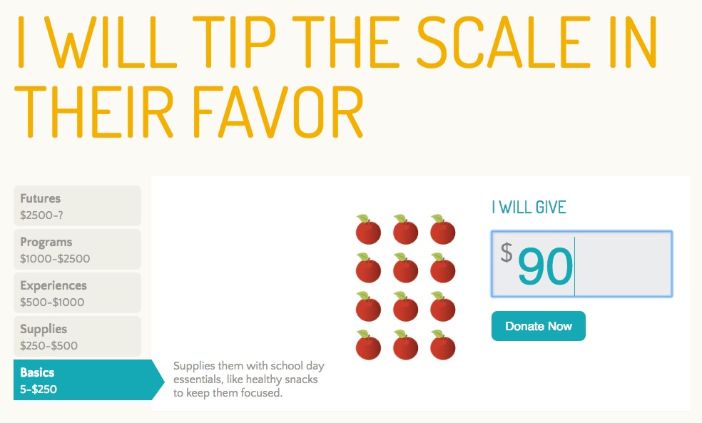
Saturday Place’s donation page builds a strong sense of commitment. It is hard to read some of the copy on the page without feeling an obligation to follow through with a donation. The strong active voice ‘I will’ is designed to motivate their users to donate.
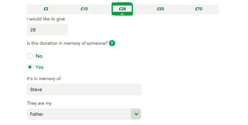
Macmillan use personalisation to build a sense of commitment. By allowing users to personalise their donation to be in memory of a loved one, they are more obliged to see the transaction through. An improvement to this flow could be to ask that question first. Framing the donation at a personal level before selecting a donation value may encourage larger donations.
Pulling it all together
In the above examples, we’ve seen some powerful illustrations of persuasive design in action. Do not underestimate the power of psychological nudges online. They will make a significant difference to the conversion rate of your donations page.
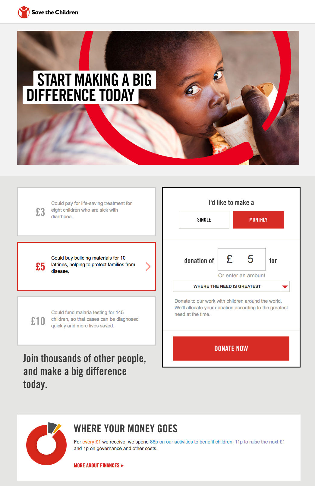
We’ll end by evaluating Save The Children. This donations page uses all the principles I’ve discussed, together to create a powerful donations page.
Take a look at the screenshot below and see what you can spot. I’ll run through them below.
Trust and credibility
- Clean, professional design to inspire credibility.
- A clear explanation of where your money goes builds trust.
Emotional triggers
- Strong copywriting, encouraging action.
- Emotional, human imagery.
- Storytelling about the difference your donation will make.
Contrast and reciprocity
- Three suggested donation levels: £3, £5, £10.
- Two suggested approaches ‘Single’ and ‘Monthly’.
- Default suggestions are ‘£3’ and ‘Monthly’, setting up the ‘rejection then retreat’ technique.
Commitment
- ‘Make a big difference’ is repeated twice; this statement brings a sense of obligation.
- The user has the option to decide where they want their donation to go. Allowing personalisation strengthens the commitment.
Bonus point
Did you spot a persuasion technique in this page we haven’t discussed? The phrase ‘Join thousands of other people and make a big difference’ creates a sense of community belonging to encourage donation. This is called social proof.
Persuasive web design works
Persuasive design makes use of the deeply embedded psychology of ‘wanting to help’ that is inherent in us all.. This opens up an ethical question; when does it become manipulation? I won’t get into that debate here. My advice is to focus on staying honest and user centric. Persuasive design should encourage users down paths they were already headed, not trick them.
If you want your designs to achieve positive outcomes for your organisation, you should be starting every design project with persuasive design in mind.